Why do so many technically sound mobile applications fail to generate meaningful revenue despite steady download numbers? The root of this problem often lies in a mismatch between software capabilities and actual user intent. A successful digital product must be engineered to solve specific user friction from the very first interaction. When we map development directly to the reasons users search for a solution, retention and monetization naturally follow.
User intent mapping is the process of aligning a software application's features, navigation, and monetization strategy directly with the primary goal a user is trying to achieve. In my experience conducting user research, I've observed that development teams often build complex features based on assumptions rather than observed behavior. This leads to bloated interfaces where users struggle to find the one tool they actually downloaded the app to use.
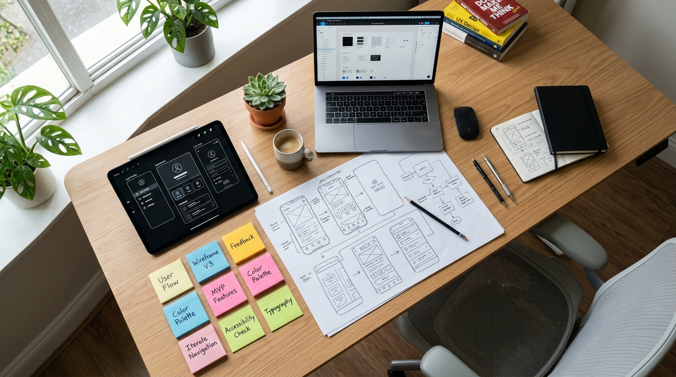
To fix this, we have to look closely at the problem we are solving and design the solution around the user's natural workflow.
Map Development Directives to Core User Friction
Every successful digital product starts as an answer to a specific problem. When a professional software development company begins a new project, the first step shouldn't be a feature list; it should be an analysis of the friction the user is trying to eliminate.

Consider the vast difference in mindset based on what a person is trying to accomplish. A user hurriedly searching for a mobile document editor has an immediate, highly transactional intent. They likely need to sign a contract or correct a typo right now. The interface must be stripped of distractions, allowing them to complete the task in seconds.
Conversely, a business owner looking for a mobile CRM to manage client relationships, or researching complex enterprise solutions like an inventory management system, requires a high-trust, data-heavy interface. Their intent is analytical and long-term. If you offer a tool that helps them determine project timelines or allows them to sync data with cloud accounting software, the UX must prioritize transparency, data security, and clear step-by-step guidance. Treating these two different intents with the same generic interface is a guaranteed path to high churn rates.
Analyze Market Data to Validate Your UX Decisions
Good UX is backed by hard market data. We cannot rely solely on aesthetic preferences; we have to look at where the industry is moving and how users are actually spending their time and money.
The scale of the mobile ecosystem demands this analytical approach. According to data from Appinventiv, referencing Sensor Tower projections, the global mobile app market is on track to hit $2.2 trillion by 2030, with 88% of users spending their digital time on smartphones. This massive audience isn't just browsing; they are transacting.
Research from Crossway Consulting highlights that in-app purchases (IAPs) hit the $150 billion mark in 2024, accounting for nearly 50% of all mobile app revenue. Users are willing to pay, but only when the value exchange is immediately clear and the transaction process is frictionless.
As our team has explored in previous discussions regarding ad markets, capturing this audience requires aligning your software architecture deeply with user intent. If the technical foundation is shaky or the UX creates unnecessary steps, users will simply abandon the cart or uninstall the app.
Design for Accessibility to Maximize Retention
Accessibility is frequently treated as an afterthought or a compliance checklist at the end of a development cycle. As a UX designer specializing in accessibility, I can tell you that this approach severely limits your product's potential market. Designing for accessibility means ensuring your products work for everyone, which inherently creates a smoother, more logical experience for your entire user base.
When you improve color contrast, enlarge touch targets, and simplify navigation hierarchies, you aren't just helping users with visual or motor impairments. You are helping the user who is trying to tap a button while walking, or the user trying to read text in bright sunlight. By offering an interface that adapts to human limitations, you reduce the cognitive load required to use your application.
At our studio, integrating these principles early in the wireframing stage prevents expensive redesigns later. It forces us to ask critical questions about screen real estate and informational hierarchy, ultimately leading to a cleaner, more focused product.
Align Monetization Models with Natural Workflows
A persistent problem in app design is the aggressive implementation of monetization strategies that actively fight against the user experience. Interrupting a critical workflow with an unskippable video or hiding a core feature behind a paywall without prior warning breeds immediate resentment.

Instead, monetization should feel like a natural extension of the utility provided. The numbers backing the advertising model are substantial. IMARC Group estimates that the global in-app advertising market will reach a projected $836.7 billion by 2034. The revenue potential is significant, but capturing it requires a careful balance between profit and usability.
Here are practical answers to common UX strategy questions regarding monetization:
How do we balance ad revenue with user experience?
Place advertisements at natural break points in the user journey. If you are designing a utility app, show an ad after the user has successfully completed their task—like exporting a file or finishing a calculation—not while they are in the middle of entering data.
When should we gate features behind in-app purchases?
Offer the core utility for free to build habit and trust. Gate the advanced functionalities that save time or offer professional-grade outputs. Let users experience the primary value of the software before asking them to commit financially.
Evaluate Your Ecosystem for Long-Term Growth
Building a single app that solves one problem is a great start, but establishing a sustainable company requires thinking about your entire digital ecosystem. This involves looking at how different products interact, how data is shared, and how user trust is maintained across multiple touchpoints.
As a company based in Istanbul, InApp Studio evaluates user problems comprehensively before writing a single line of code. We focus on utility, ensuring that every feature we ship directly addresses a validated user need. In our internal project reviews, we emphasize that real outcomes and process automation matter far more than sheer download metrics.
When you approach software design from a foundation of user research and accessibility, you stop guessing what the market wants. You start observing where the friction lies and delivering precise, elegant solutions that users are happy to integrate into their daily lives.